Creating Characters

Today I want to talk about my process for creating characters from concept to model to in-engine.
Concept
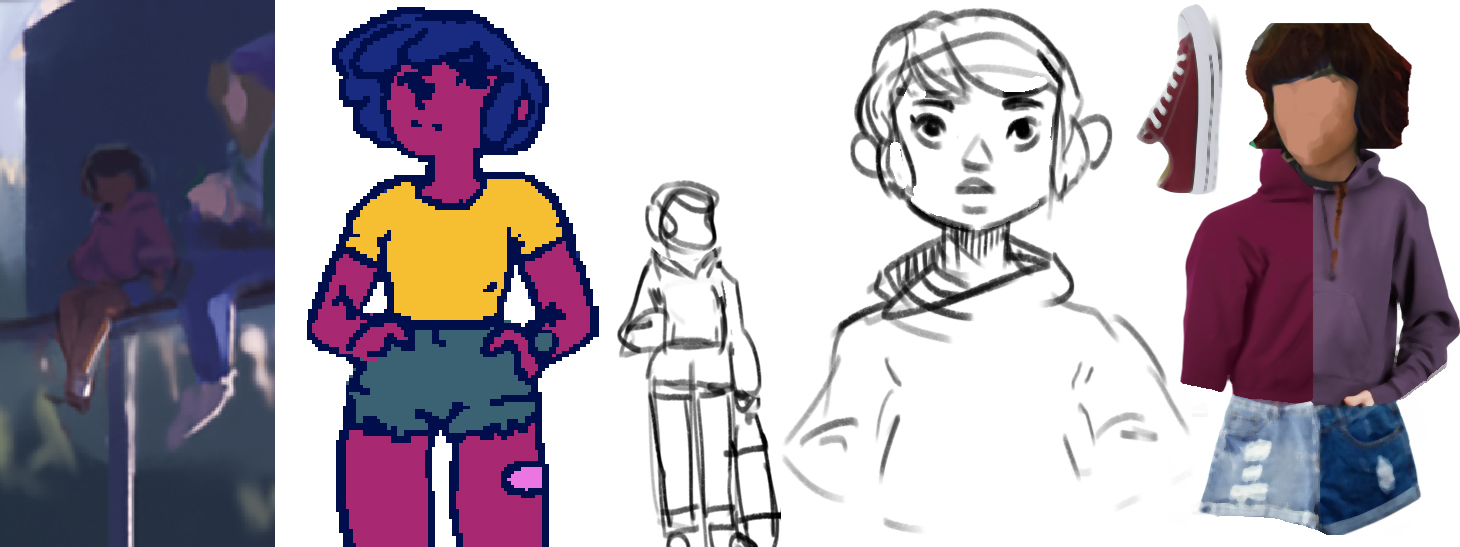
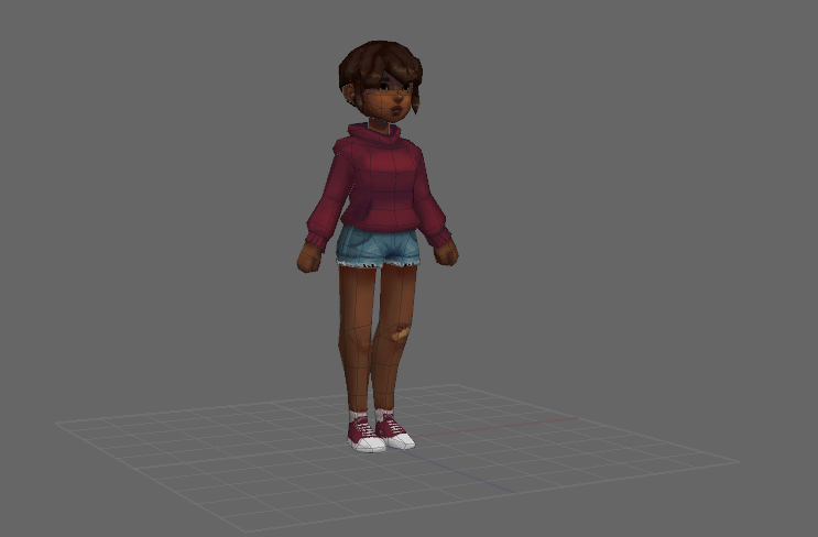
Before I begin the modeling process, it's important to know where that process is headed. The characters I created for Turnpike North have been in my head for quite some time. They were featured in my game BRUISES, so their main features were already there. However, considering that I was going for a different style in Turnpike North (PSX aesthetics), it still made sense to put together a concept board I could use as a target.
Modeling Process
I use a software called Silo for modeling. The main reason being that I had purchased it like 10 years ago (back in a time of permanent licenses) and I've since gotten quite comfortable using it. And I think that's important: it doesn't matter which software you're using, as long as it exports to the formats you'll need in the engine (.fbx for Unity). You should feel comfortable working with the software.
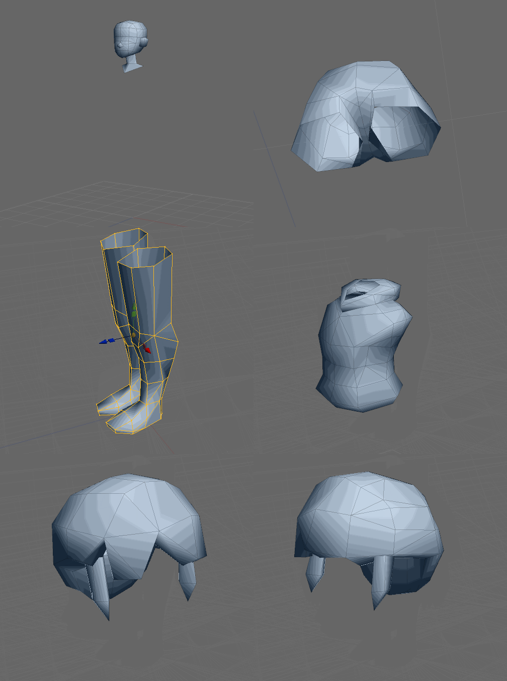
Most of my character models start with a cube. I'm making heavy use of the mirror modeling of course. In the spirit of blocking I start with the larger shapes, to get the proportions of the character right. Once that is done, I can start refining the shapes. Little extrusion at this stage but lots of inserting edge loops.
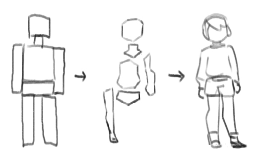
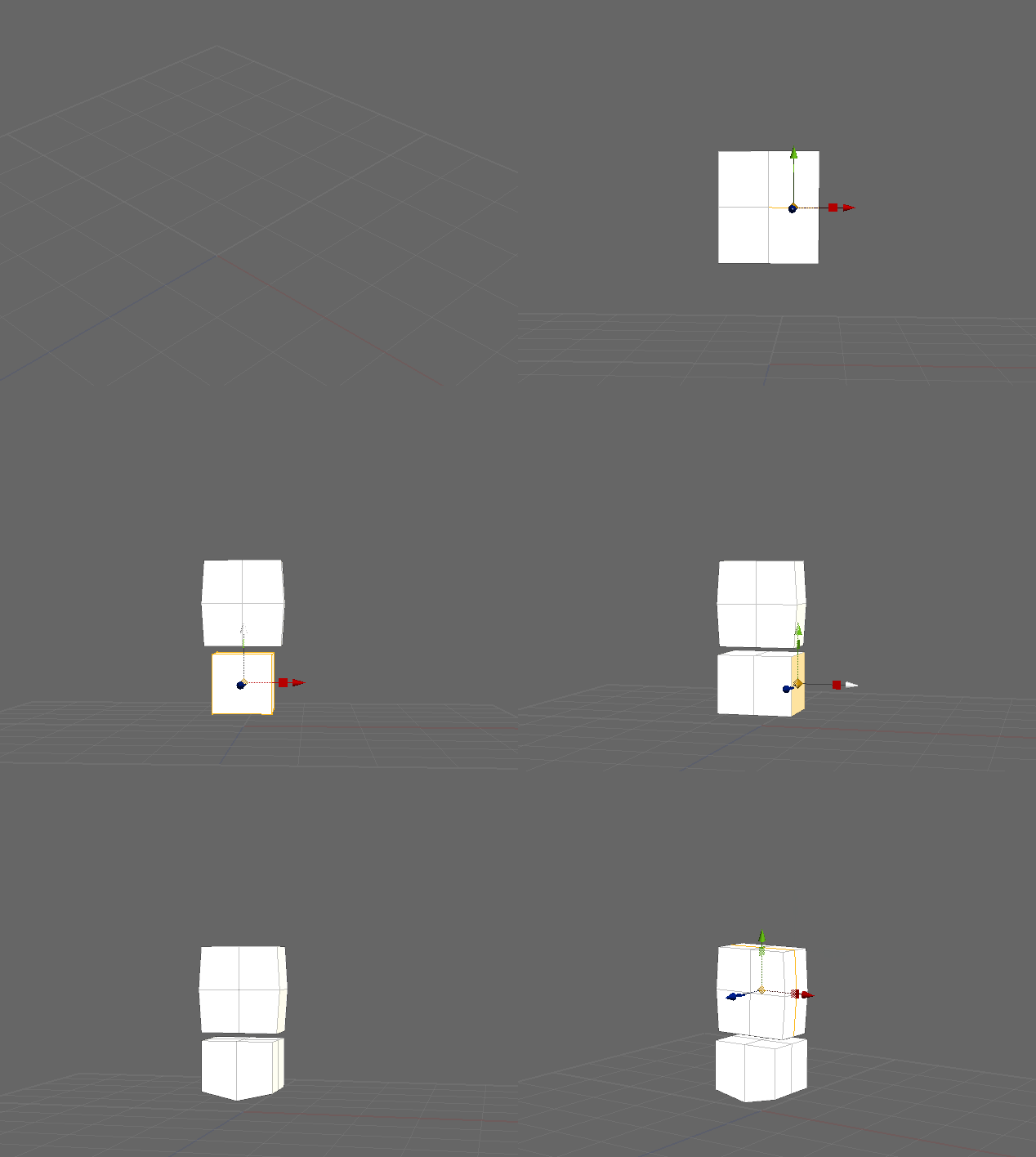
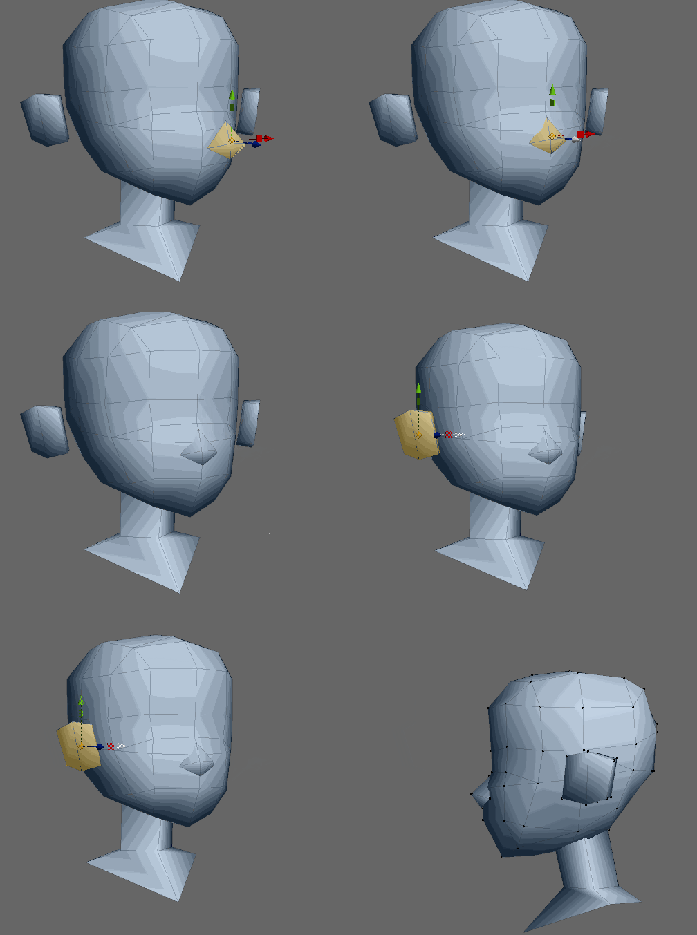
It's worth remembering that I'm going for a low poly model (~ 1k polys). Some may think it is ugly or not "right" but I'm perfectly fine with sticking meshes into each other. This is relevant because it means I don't have to account for where an arm needs to go into the torso or similar cases (= lower poly count). When modeling, I'm constantly checking the silhouette from all the different angles and zoom levels and tweak vertex positions until they're just right. And while I start with quads, deliberate placement of edges is crucial to control the silhouette.
Texturing Process
UVs
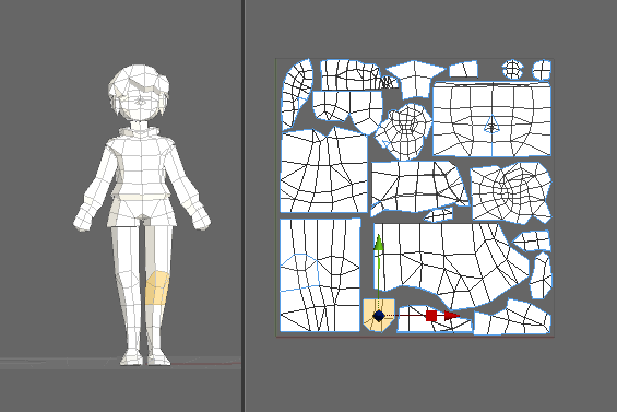
Once the model topology is done, I move on to the part I don't like: UVs. In this day and age, there really isn't much of an excuse for lamenting about UV layout, as there are many software packages out there, that will help tremendously in making the process as painless as possible. But here's the thing: my texture is going to have a small resolution and I want to avoid having too many stretched, or worse, diagonal pixels. Moreover, I want to use as much texture space as possible, which is why I want to have precise control over the UVs and seams. So an automatic UV layout can be a good start, but I need to go back in to tweak stuff.
Another important thing to decide is which parts are going to be mirrored (overlapping UVs) and where do I want the control of both sides. I tend to make the face UVs non-overlapping, to add differing details to both sides of the face. For the rest of the body, I'm fine with mirroring. If I need details, I can add individual meshes or cut out individual areas with their own UVS.
Texturing
For texturing, I again work from big to small. Blocks of colors first, then detail later on. Here, I'm using 3DCoat. But, again, the software doesn't matter.
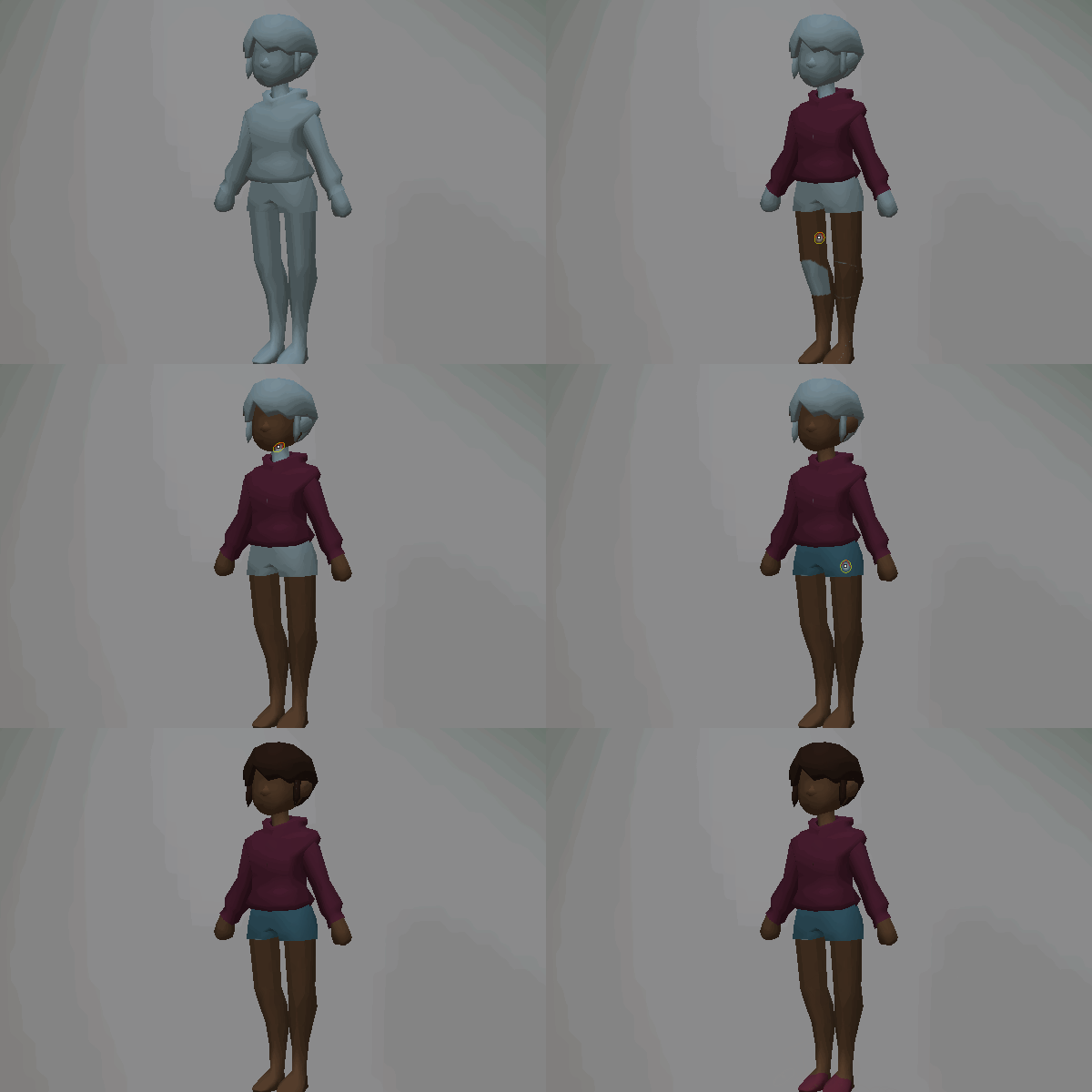
I like to do a "line-art" pass with black or a darker color after the larger blocks of color are in. In this pass, I draw in details like seams for clothes, eye sockets, eyebrows, mouth, fingers... you get the idea. This allows me to refine the texture in whichever software I want. This is important for me, as the mindset switches when switching from, 3DCoat to, say, Aseprite. I'm no longer thinking of a 3D Model but, rather, in pixels. That allows me to be much more mindful of color and texture space.
Unity (HPSXRP)
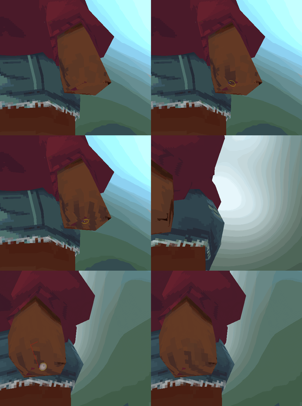
Now that model and texture are done, it's time to put the character into the engine. What I usually do is, work on model and texture inside the project (i.e. model and texture are already in the Unity Project). That allows me to review the model in context as I work (various camera angles, colors, etc.).
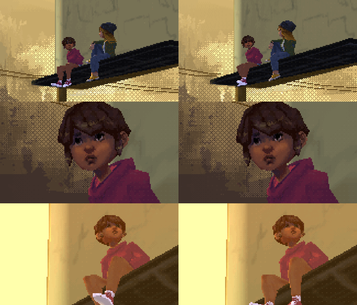
TURNPIKE NORTH is made in Unity3d using the HPSXRP, a render pipeline that emulates PS1 era graphics on modern machines. If you'd like to know more, check out my previous devlog entry about setting up your project with the HPSXRP.
Unfortunately, the way the lighting is set up, the majority of the model and texture I just worked on is in shadow, i.e. total blackness. To avoid that, I'm utilizing the Emission using the same texture in the emission channel at a low intensity. Here it's at 0.2. By applying the color of the emission map, I can now also control the color of the shadow.
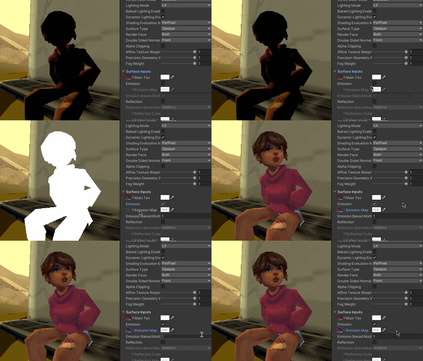
Et voilà! Our character is in the engine and ready to go. If you're still around: thanks for reading all the way to the end. I hope it was insightful!
- leafthief
TURNPIKE NORTH
Creating a real-time PSX scene inspired by Life is Strange
| Status | Released |
| Category | Other |
| Author | leafthief |
| Tags | life-is-strange, Low-poly, Point & Click, PSX (PlayStation), vignette, ya, young-adult |
More posts
- Building the SceneJan 23, 2021
- Setting up the HPSXRPJan 12, 2021
- Creating TURNPIKE NORTHJan 11, 2021
Comments
Log in with itch.io to leave a comment.
Thanks!
when this comes out ima play it on my channel
This was really interesting, i've been wanting to learn how to make something in this engine, I think this may push me to go for it!